information machine technology hardware information machine technology information machine technology hardware information machine technology
information machine technology hardware information machine technology information machine technology hardware information machine technology
information machine technology hardware information machine technology information machine technology hardware information machine technology
information machine technology hardware information machine technology information machine technology hardware information machine technology
information machine technology hardware information machine technology information machine technology hardware information machine technology
information machine technology hardware information machine technology information machine technology hardware information machine technology
Tuner ∗ Tuner ∗ Tuner ∗ Tuner ∗ Tuner ∗ Tuner ∗ Tuner ∗ Tuner ∗
Tuner ∗ Tuner ∗ Tuner ∗ Tuner ∗ Tuner ∗ Tuner ∗ Tuner ∗ Tuner ∗
Tuner ∗ Tuner ∗ Tuner ∗ Tuner ∗ Tuner ∗ Tuner ∗ Tuner ∗ Tuner ∗
Family: 10 Styles
[5 weights roman and 5 weights in italic]
Character set: 587 glyphs per style
Alternates Letters imprint of original drawings
Alternates figures for numerals, checkboxes and geometrical drawing shapes
Monospaced numbers with two squares versions of alternate numbers
Origin ✇ Origin ✇ Origin ✇ Origin ✇ Origin ✇ Origin ✇ Origin ✇ Origin ✇
Origin ✇ Origin ✇ Origin ✇ Origin ✇ Origin ✇ Origin ✇ Origin ✇ Origin ✇
Origin ✇ Origin ✇ Origin ✇ Origin ✇ Origin ✇ Origin ✇ Origin ✇ Origin ✇
Low-resolution…
Character of invariability
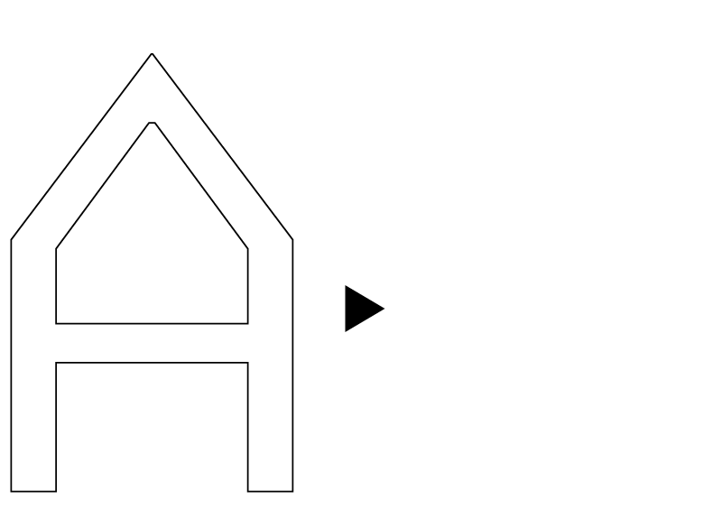
Superposition of letters to find a model
Design ☒ Design ☒ Design ☒ Design ☒ Design ☒ Design ☒ Design ☒ Design ☒
Design ☒ Design ☒ Design ☒ Design ☒ Design ☒ Design ☒ Design ☒ Design ☒
Design ☒ Design ☒ Design ☒ Design ☒ Design ☒ Design ☒ Design ☒ Design ☒
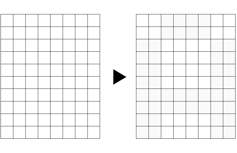
Square widths
Pixel and monospace references
Generous x-height
Ample letterspacing
Traps to avoid dark spots in small sizes
[for ink and pixel]

Italics are derived from the Roman and retain
a flavor close to an automatic inclination
Info ✈ Info ✈ Info ✈ Info ✈ Info ✈ Info ✈ Info ✈ Info ✈
→ PDF Specimen
License
Packages
Tuner Family (10 styles)
Tuner roman+italic (2 styles)
Individual styles
Tuner Light
Tuner Light Italic
Tuner Regular
Tuner Regular Italic
Tuner Medium
Tuner Medium Italic
Tuner Bold
Tuner Bold Italic
Tuner Heavy
Tuner Italic Heavy
Checkout Desktop licence
and Web licence
→ email me
300€
80€
50€
50€
50€
50€
50€
50€
50€
50€
50€
50€
Release
Designed by
10 Styles
File Formats
Contact
Copyright
2018
Simon Renaud
www.productiontype.com
5 Weights Roman/Italics
Desktop: OTF
Web: WOFF, WOFF2
info@productiontype.com
©2017 Production Type
All rights reserved